


October 2009 Weddings
Dear Community,
Our tech team has launched updates to The Nest today. As a result of these updates, members of the Nest Community will need to change their password in order to continue participating in the community. In addition, The Nest community member's avatars will be replaced with generic default avatars. If you wish to revert to your original avatar, you will need to re-upload it via The Nest.
If you have questions about this, please email help@theknot.com.
Thank you.
Note: This only affects The Nest's community members and will not affect members on The Bump or The Knot.
New and Improved...
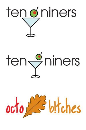
So I think the consensus for the board logo was the last one in this post, but in a martini glass. So... what do you think?
I like the second one more, I think the olive is more in proportion! If we start using this, I am going to want martinis all day everyday on here...
And Karen, here's the OctoB!tches for you, not squished like the last one was :P

Re: New and Improved...
adorable!! great job!! I agree with you, I think I like the second one best!
AWESOME!!!!
I'm going to disagree, though, and say I like the first one better. I know that WE know that the olive is the O (as in '09), but if people don't know that's a letter, they're just going to read "ten niners." (I tested this on my husband.) I think we need to keep the olive big to keep it text-like.
Good point, Karen!! I didn't even think of that
MY BLOG!
Visually I like the second one better, but I agree with PP. For someone who doesn't know us I believe they'll read the top one correctly, but they will only see the second one as ten-niners.
Great job!!!